High-end e-commerce UX/UI for RUBY

Turning heat map insights into a conversion-focused UI overhaul
Ruby UK, a Devon-based manufacturer of handcrafted garden structures (gates, pergolas, car ports), came to Studiose with a redesign brief shaped by internal stakeholder notes.
Rather than relying on assumptions, I grounded the entire design process in analytics, using heat maps and page view data to identify exactly where the site was losing customers, then designing wireframes that solved those specific problems.




The Challenge
Initial stakeholder notes flagged general concerns: an outdated, “out-of-the-box Shopify” feel, unclear messaging, and a clunky checkout. Useful starting points, but not enough to prioritise design decisions on their own.
I needed to know: where, specifically, are visitors dropping off?
1. Qualitative Review
Started with stakeholder review notes covering the Homepage, Category, Product, and Checkout pages, capturing pain points and business context (handmade lead times, bespoke ordering, nationwide delivery).
2. Quantitative Analysis
Analysed exported heat map and page view data across the site to validate (or challenge) those qualitative notes. This surfaced a critical finding: while category and product pages had strong traffic and healthy browsing behaviour, only 1.3% of product page visitors added an item to their basket, well below the 5–10% industry benchmark.
The data made clear that the product page, not the homepage, was where revenue was being lost.
3. Synthesis
Combined both data sources to build a prioritised list of specific, addressable problems, e.g. no visible delivery confirmation, buried bespoke-order options, and unclear lead times, all directly correlated with the drop-off point identified in the data.
4. Wire frames
Designed mobile-first wireframes for the Homepage, Category, and Product pages, each annotated to show exactly which conversion barrier it addressed. Followed up with desktop versions, adapting the layouts to take advantage of larger screens (sidebar filters, sticky galleries, multi-column layouts) while keeping the same underlying logic.
The result is a more holistic set of guidelines: not just how the brand looks, but how it feels, sounds, and behaves.
Key Design Decisions
- Delivery checker on product pages — directly answering the most common customer objection (“do you deliver to me?”)
- Visible lead times — managing expectations around handmade production
- Equal-weight CTAs for standard and bespoke orders, so custom sizing wasn’t a hidden afterthought
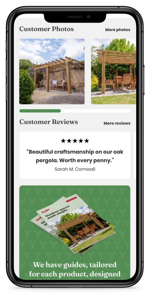
- Customer photo galleries — social proof for high-value purchases (£1,000–£5,000+ items like pergolas and car ports)
- Condensed homepage — from 8 scrolling pages down to a focused trust-first experience


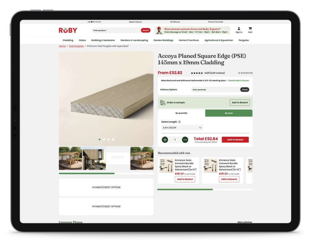

From Wireframe to On-Brand UI
With the structural problems solved at the wireframe stage, the next step was building a visual language that felt right for the product and the customer buying it.
Ruby UK’s audience skews older and more affluent: homeowners investing £1,000–£5,000+ in a handmade garden structure. That customer doesn’t respond to a generic Shopify template; they respond to craftsmanship, quality, and quiet confidence. So the visual direction moved deliberately away from bright, high-frequency “e-commerce sale” aesthetics toward something calmer and more considered.
Colour
A deep forest green, echoing the natural materials (oak, cedar, larch) paired with a red accent. Used sparingly, the red draws the eye to key actions (CTAs, trust signals) without feeling like a discount banner.
Typography
A serif display face for headings, paired with a clean sans-serif for body copy. The serif signals heritage and craftsmanship at a glance; the sans-serif keeps product specs and functional copy easy to scan.
Spacing & Restraint
Generous whitespace and simplified layouts, avoiding the cluttered, promo-heavy feel of the original site. For this audience, restraint reads as premium.
Consistency Across Breakpoints
The same visual language, colour, type, spacing rhythm, was carried through from mobile to desktop, with layout (not style) adapting to the larger canvas: sidebar filters, sticky product galleries, and multi-column grids replaced their single-column mobile equivalents, but nothing about the brand feel changed between devices.