RUBY Brand Strengthening
RUBY exists to help people build beautiful, long-lasting outdoor spaces with sustainable timber, expert craftsmanship, and complete confidence, from off-the-shelf to fully bespoke.


From foundations to a fully defined brand
RUBY Group came to the project with the beginnings of an identity: a logo and a colour palette. The opportunity was to take those foundations and build something with greater depth, clarity and purpose, a brand that felt as considered as the products and craftsmanship behind it.
The starting point was understanding what RUBY truly stands for.
To help people build beautiful, long-lasting outdoor spaces with sustainable timber, expert craftsmanship, and complete confidence, from off-the-shelf to fully bespoke.
This purpose became the foundation for the brand development. Alongside it, a series of brand statements were established to define RUBY’s positioning, values and personality. Together, these provided a clear articulation of what the business represents, creating a strategic framework for the visual identity to grow from.
Creating a distinctive visual language
With the foundations established, the existing logo and colour palette were developed into a complete visual language.
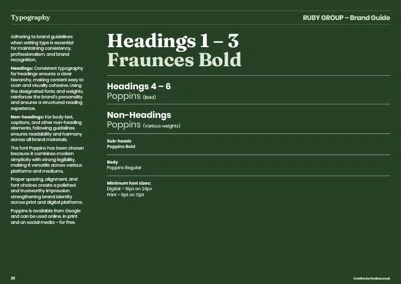
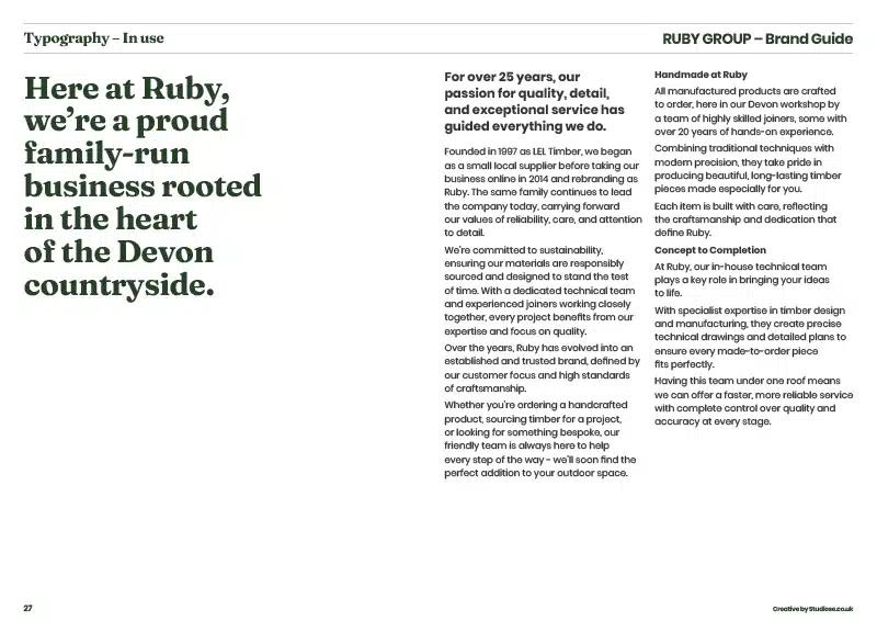
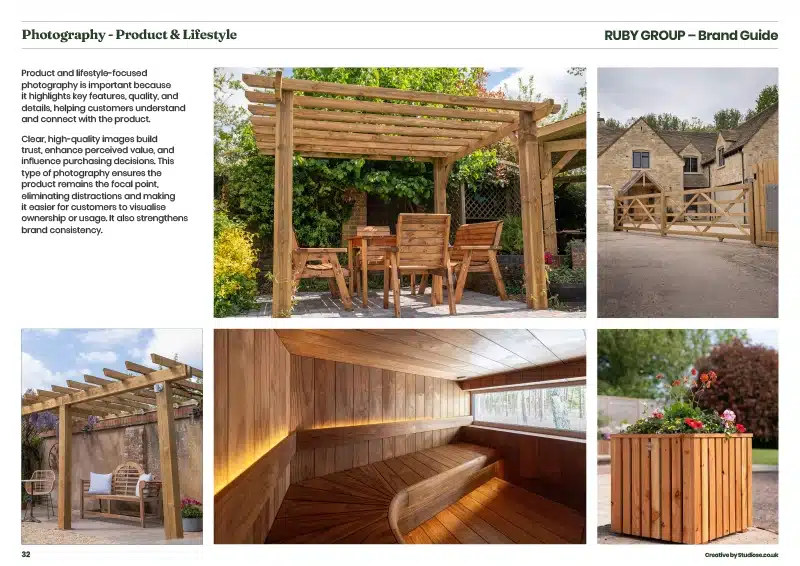
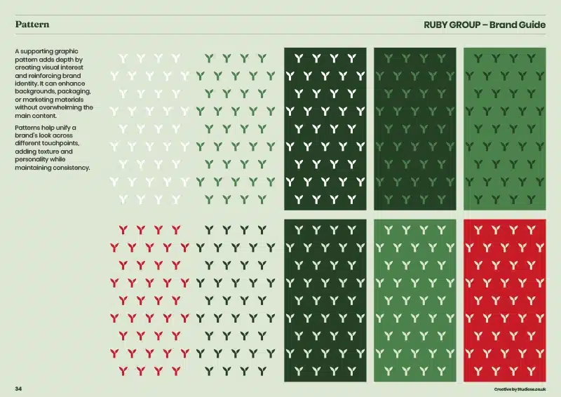
Typography, imagery, composition, graphic details and the use of colour were carefully considered to create a brand that feels refined, confident and inherently connected to its category. Rather than introducing unnecessary complexity, the approach was about bringing greater intention to every element, creating a visual system that feels natural, distinctive and unmistakably RUBY.
The ambition was to position RUBY within the premium market, while retaining the warmth, authenticity and accessibility that are central to the brand. The resulting identity balances sophistication with substance, reflecting both the beauty of the finished outdoor spaces and the expertise, craftsmanship and sustainable materials that go into creating them.
Building a brand to last
The final stage was to bring the thinking and visual identity together within a comprehensive Brand Guide.
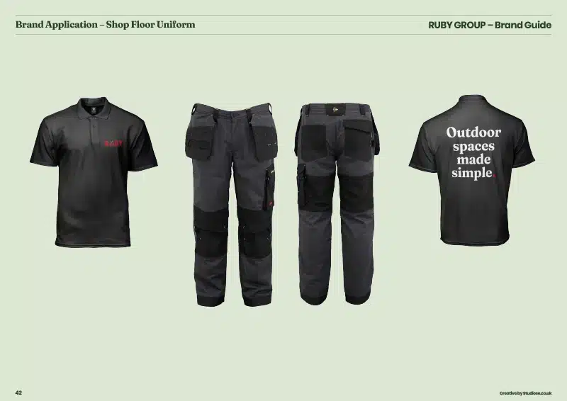
More than a set of design rules, the guide provides the business with a clear foundation for how RUBY should look, feel and communicate. It captures the brand statements, visual principles and practical guidance needed to maintain consistency as the business develops — whether applied across marketing, digital, printed materials or future brand touchpoints.
The result is a brand that has evolved from a logo and colour palette into something with genuine depth and definition.
A considered, premium identity with a clear purpose, a distinctive visual language and the framework to remain consistent as RUBY Group continues to grow.










From brand to digital experience
Importantly, the brand development became the foundation for the next stage of the project: the redesign of RUBY’s website and ecommerce experience.
The newly defined positioning, visual language and brand principles provided a clear direction for how the digital experience should look, feel and perform. The same focus on clarity, confidence and considered detail was carried through into the customer journey — creating an e-commerce experience that better reflects the quality of the brand while making the process of choosing and buying from RUBY simpler and more intuitive.
